Marek Pawluch
1. Description
I came across Marek by accident while building my own family tree. We share the same surname, so I decided to investigate whether our family lines might intersect somewhere in the past.On his old website, there was  contact detail: Call Monday to Friday between 4:00 PM and 5:00 PM.

At exactly 4:00 PM, I called."Hello, my name is Karol Pawluch. As it happens, we share the same surname, and I'm researching its origins. I'm building my own family tree, so I thought, why not build yours as well and see if they connect? Would you have some time to tell me about your family?"He replied that the best time would be that very day, and we ended up meeting online a few hours later.

During our conversation, I asked what had led him to orthopedics. It turned out that he had initially been drawn to chemistry and scientific research, but worried that working in a laboratory would distance him from people. He chose clinical medicine instead, and eventually orthopedics, attracted by its complexity and the fact that every case presents a different challenge. At one point, he noticed my logo and asked what I did for a living. When I showed him my portfolio, he said, "Perfect, because I need a website."
2. Initial Brief
Target audience:
Patients from Koszalin, Słupsk, and the surrounding areas are seeking a trusted specialist for musculoskeletal injuries and disorders.
Brand attributes:
Trustworthy, reliable, professional.
Additional consideration:
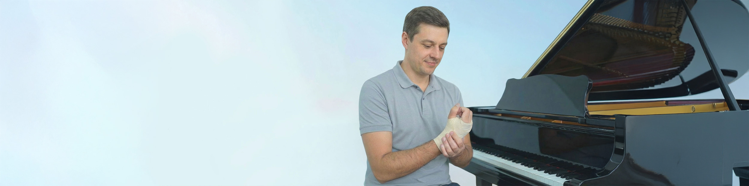
A concern was that patients might think: "He only treats hands, so he probably can't help with my knee problem."
Scope of work:
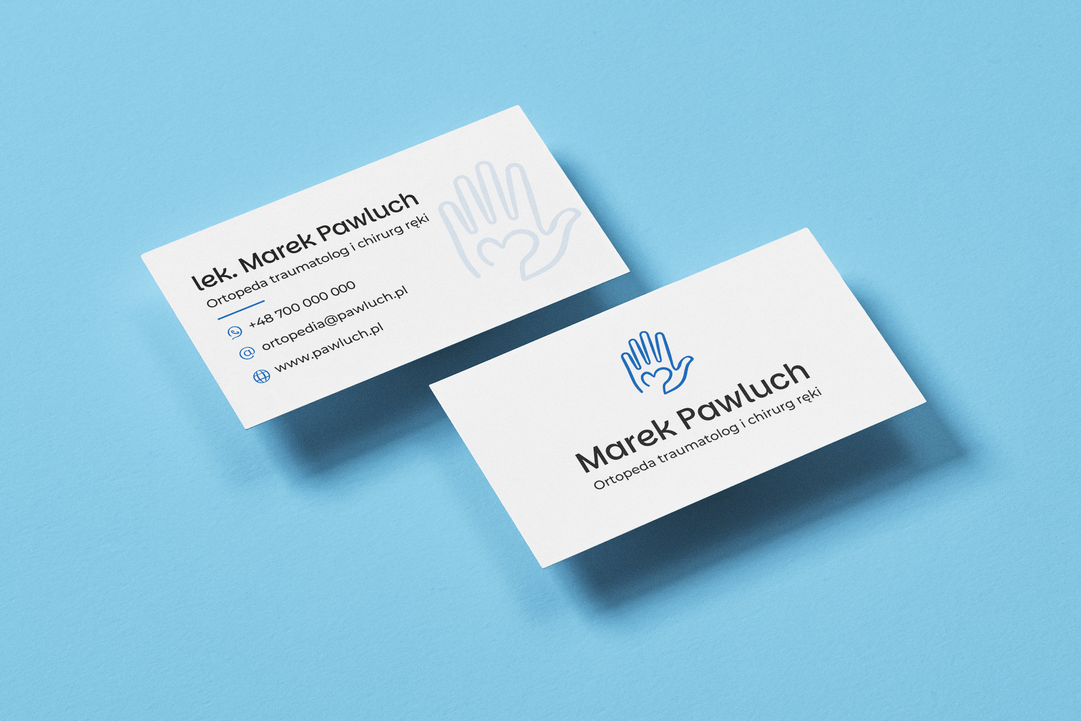
Brand positioning, brand differentiation, color palette, typography, logo design, business card, icon system, and website design.
3. Industry Symbols
I reviewed the visual identities of hand surgeons in Poland and abroad. The conclusion was clear: the hand is the common visual denominator of the category.

Psychology tells us that people instinctively distrust what feels unfamiliar. If a medical brand moves too far away from established industry codes, it can subconsciously reduce trust
4. What Patients Were Missing Elsewhere
To understand unmet patient needs, I analyzed reviews of competing orthopedic surgeons and hand specialists, paying particular attention to negative feedback.
Common comments included:
"Even after three appointments, I still didn't know what was wrong with me."
–"What was missing were the basics — a few simple sentences explaining what my condition was, what caused it, and what I needed to do to recover."
– "For him, it's all about the money."

Patients rarely complained about their doctors' medical expertise. Instead, they criticized the lack of empathy and communication. They felt unheard and left without a clear understanding of their condition.
5. Strategic Direction. A Doctor with His Hand on His Heart
During our conversations, Marek Pawluch shared an idea that became the foundation of the entire brand.For him, medicine is not primarily about money. He sees it as a mission."I genuinely want to help people." This mindset aligned perfectly with what patients were missing in their experiences with other specialists.
6. The Symbol
From initials to anatomy. The final mark evolved from an earlier concept. I combined the initials M and P into a single form—one that can be read simultaneously as a bone and a heart. I then embedded this shape within a hand. The result is a hand holding a heart.
Bone — expertise, orthopedics, and the profession's solid foundation.
Heart — empathy and purpose, Marek's key differentiator and a direct response to the concerns uncovered during research.
Hand — a category cue associated with hand surgery that reinforces familiarity and trust.
7. Outcome
The result was a brand that reflects its owner. Competent, professional, and distinctly medical, yet at the same time approachable and human. The soft geometry of the symbol, the Parkinsans typeface, and the simple visual system all communicate what emerged as the most important insight from the research: Behind the specialist stands a person who genuinely wants to help.
8. Website & Visual Identity
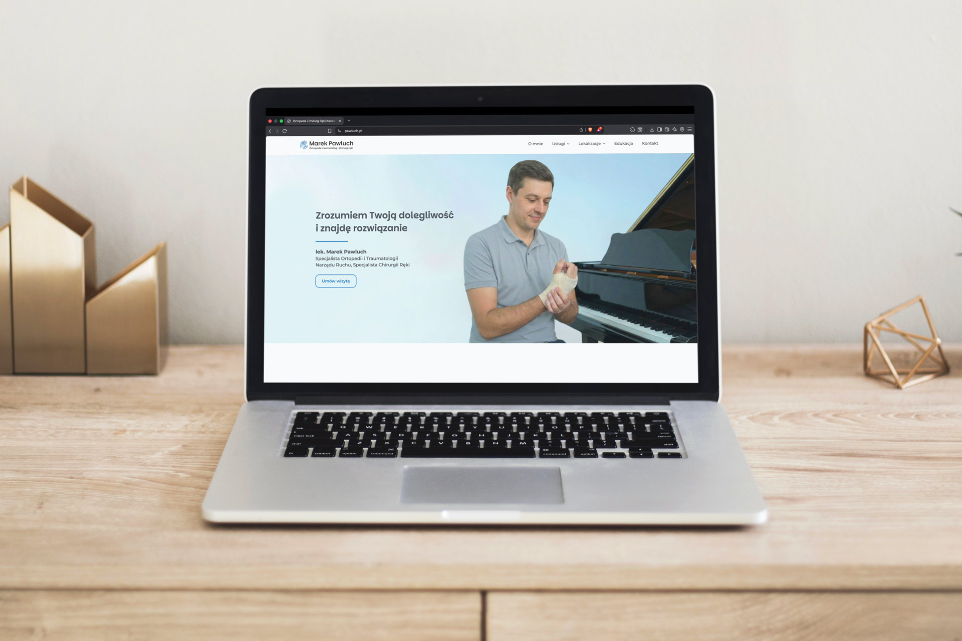
The project included the logo, visual identity system, and website (currently available at).The website opens by presenting the wide range of conditions treated by Marek Pawluch, helping visitors understand that hand surgery is only one part of his practice.The next section explains the role of an orthopedic specialist. Orthopedics is not just about bones—it encompasses the entire mechanics of movement, including bones, nerves, joints, and muscles.These areas and their related services were translated into a custom icon system designed to visually align with the logo.The Parkinsans typeface was used consistently across both the logo and the website's headings, creating a cohesive and recognizable visual language.
Other projects
If my life portfolio caught your interest and you think we can get along, let me know.
Kontakt@karolpawluch.pl
+48 537 332 183